Nina's Textile Trail

My OCA Textile Tales


Leave a comment

Part 2 Building a Visual Vocabulary – Stage 4 – Developing Design Ideas – Experiments with printing & painting – PRINTING ON FABRIC

DSCN2880

Left: top three Silk cotton printed with acrylic paint mixed with textile medium with a make up sponge.

On this fabric, the texture from the printing plate is as clear as printing on paper and gives interest.

Left: bottom. Bondaweb painted with acrylic paint, allowed to dry and ironed to calico.

Right: photograph of soft pastels printed on heat transfer paper for light fabrics (red grid) and ironed onto muslin.

I think the heat transfer paper is effective and could prove useful in future.

DSCN2881

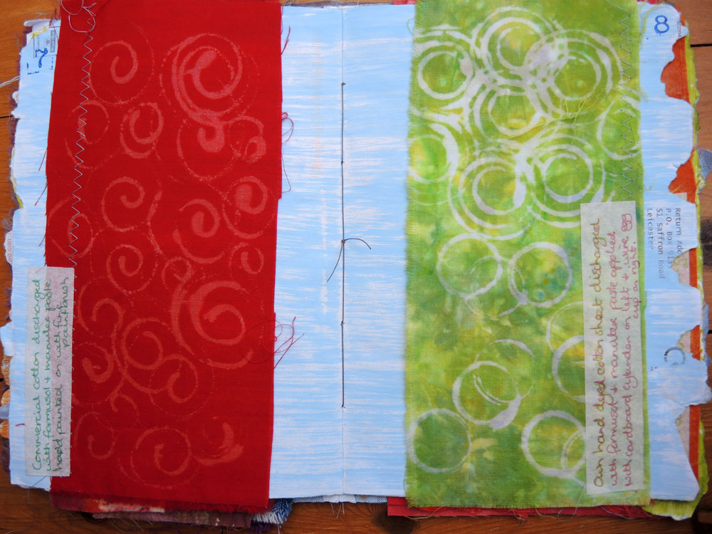
The spirals were produced by using thickened procion dye, thinned to be used through a needle nosed bottle.  The spiral was ‘drawn’ onto an acrylic circular plate and stamped onto dry soda soaked cotton.  It was batched, washed and dried and then painted.  The left was painted with Jacquard Dye-na-flow, heat set, washed and dried.  I didn’t think to use a water-based resist or to dry each colour between applications so the colours have spread.  I quite like the effect but would like to try dye-na-flow with water-based gutta to see how effective it is.  I like the Dye-na-flow, the colours are vibrant and the fabric has a soft handle.  The right hand side was painted with acrylic paint mixed with textile medium, heat set, washed and dried.  I like the colours which I was trying to replicate from my previous work, but the fabric is stiff and this method would not suit something that needed a soft handle.

DSCN2882IMG_1985

Left on cotton and right on cotton poplin.  Both Markal paintsticks applied to masking tape then lifted with stencil brush and applied through acetate stencil.  The brush was moistened with zest it solvent, which was a serendipitous discovery.  I learned from Susan Stein’s book that Markal paintstick brushes can be cleaned with zest-it solvent (I had been wondering how to clean the brushes and it hadn’t occured to me that a solvent would be required!).  Having cleaned my brush before starting, I realised that the trace of solvent left on the brush transformed the paintstick into something that could be applied with subtlety and really like the effects created through the above stencils.   I already appreciated the lovely creamy texture and pigment of the paintstick when used on paper and although I could draw with it on fabric, didn’t find it very flexible.  I am now convinced that they are a very versatile addition to my toolbox!

DSCN2883

The above cotton poplin is printed with procion dye thickened with manutex pasted applied to dry soda soaked cotton poplin, patterned with the end of some corrogated plastic on the left and with the edge of a credit card on the right.   Because the fabric is soda soaked, the dye takes quickly.  The paler orange was then scraped across the surface with a credit card. The fabric then needs to be wrapped whilst damp without touching other pieces and left overnight.  Then rinsed and washed as normal, resulting in fabulous colours and a soft handle.

This is a really versatile technique, although potentially messy to set up if working in your spare bedroom!

DSCN2884

Left: Washed linen scrim painted through stencils with acrylic paint mixed with textile medium.  Unsuccessful Neocolour II crayons top right.

I love the washed linen scrim and like the leaf print because it seems right for the fabric.

Right: Tussah silk top half marked with neocolour II and aquarelle pencils moistened with textile medium and acrylic black and white paint.  This sample was produced as suggested where colour is less important.   The marks have added texture but I love the Tussah silk as it is and think I could have better demonstrated embellishing/extending the surface quality of the fibre and structure of the cloth had I chosen differently.

DSCN2885

Left: Further example of cotton poplin printed with procion dye thickened with manutex pasted  & applied to dry soda soaked cotton poplin.  This was patterned with the end of a cotton bud.

Right: Unwashed linen scrim painted with acrylic paint mixed with textile medium.  Unsuccessful lino print bottom left.

Love the linen scrim washed and unwashed, although unwashed it has a lot of sizing and its shrinks and changes considerable on washing.  Love the leaf prints as they work well with the scrim and in those colours.  The lino prints didn’t work well as the fabric was too textured.

DSCN2886

Left: Cotton poplin printed with two easycut lino blocks.  Acrylic paint and textile medium applied with coarse brush. Jacquard lumiere in metallic copper also applied.

Like the pattern, texture and colours.  The fabric paint was more transparent than the acrylic paint and textile medium and when heat set and washed doesn’t show up as much as the other paint.  The material has a reasonable handle but not as soft as it could be with other methods.

Right:  Lightweight cotton.  Pink and metallic copper Jacquard textile paint applied with brush through acetate stencils.  Less successful print in top right corner.   Not enough paint used and stencil turned and used twice which didn’t work well.

Quite like the magenta flowers against the white and the texture of the leaf .

DSCN2887

Left: Cotton poplin decorated wit Staedler karat aquarell watersoluble pencils moistened with textile medium.

Right: Neocolour II watersoluble wax crayons moistened with textile medium.

Both heat set with iron and machine washed.

Both the pencils and crayons work on smooth fabric but neither are very exciting to me in this example.

DSCN2888

Left: Cotton scrim & nylon tulle printed with acrylic paint mixed with textile medium using make up sponge.

Both worked well and would have potential for layering.

Right: Markal paintstick rubbed over textured wallpaper plate on weakly hand dyed cotton sheeting.  Heat set with iron, washed and dried.

Although tricky to use initially, Markal paintsticks are very versatile.  I found it best to remove the skin with a sharp scalpel which was much less wasteful than using a paper towel which is often recommended.  It was helpful to know brushes could be cleaned and colours mixed using a solvent.

DSCN2879

The fabric used for the cover was a mixture of samples combined.  The right hand strip of cotton poplin is printed with easy cut lino blocks cut to represent footprint textures, using watersoluble block printing ink.  the central piece uses similar blocks and is hand dyed calico bandage.   The left hand is a piece of hand dyed fabric printed with jacquard textile paint brushed onto an easy lino cut block.

All hand dyed fabric used in all the samples has been dyed by me.

I have thoroughly enjoyed printing and look forward to developing my knowledge and experience further.


Leave a comment

Part 2 Building a Visual Vocabulary – Stage 4 Developing Design ideas – Experiments with Printing & Painting – DISCHARGING FABRIC

This section is all about experimenting with Printing and Painting and we are encouraged to supplement the notes provided by consulting the reading list.  I read Jane Dunnewold’s book, A Guide to Surface Design for Printing.  I found it to be very clear and explanatory with chapters covering adding colour with dyes and textile paints, removing colour with discharge methods, stamps and stencils, print and pattern with water-based resists, screen printing, foiling and leafing.  Whilst I could happily have spent several weeks working through the book making numerous samples, I chose to experiment with discharging fabric which is new to me.

I used formusol which is bought in powder form and can be added to water to use through a spray or to print paste.  Once applied it is left to dry and then ironed to activate the discharge process.  After I had ironed a few I realised that you can choose the amount of discharge by adjusting the length of time you apply the iron.

DSCN2872

Left: Commerical cotton discharged with formusol and manutex paste applied with brush at the bottom of the page and sprayed through cotton lace at the top.  The application through lace was not very successful although I think I used too much spray which continued to soak into the material losing the potential for a more delicate pattern from the lace.  I like the texture achieved by applying with a brush but think it would have been more obvious if I had ironed it for a little less time.

Right: Machine dyed (at home) recycled curtain discharged with formusol and water sprayed over cotton daisy chain at the bottom of page.  Unsuccessful attempt at top when sprayed through gauze bandage.

DSCN2873

Left:  Commercial cotton velvet discharged with formusol and manutex paste.  Handpainted on top and stamped with cork on bottom.

Right: Cotton denim discharged with formusol and manutex paste hand painted with fine brush.

Cotton velvet discharged beautifully.  Also like the denim.  Tried another denim sample from some old jeans but the formusol had no effect whatsoever.

DSCN2874

Left: Own hand dyed (twice) calico bandage dishcharged with formusol and manutex paste applied with flat paintbrush. Not very interesting.

Right: Own double dyed old cotton sheet discharged with formusol and manutex paste applied with credit card edge. Like the contrast been the dark red and white and the patterns created on the left by scraping the paste with the credit card.

DSCN2875

Left: Commercial cotton discharged with formusol and manutex paste hand painted with a fine paintbrush.  This commercial fabric didn’t discharge much colour.

Right: Own hand dyed cotton sheet discharged with formusol and manutex paste applied with cardboard cylinder at bottom and wire egg cup on top.  Really like the effect on the mottled fabric on top right.

DSCN2876

Both hand dyed lightweight cotton on left, calico on right, discharged with formusol and manutex paste using an acrylic stencil and the cut out.  Left hand fabric has unsuccessful blobs where paste was applied with a natural sponge.  I particularly like the mottled effect on the right hand page on the thicker calico.

IMG_1976DSCN2877

Both hand dyed with masks applied as left hand picture and formusol and water lightly sprayed onto the cloth.

The top left yellow fruit bag was unsuccessful.  I like the subtlety of the alphabet stencil which was very lightly sprayed and ironed.

IMG_1977DSCN2871

Hand dyed cotton sheeting.  I love the way this fabric has discharged back to the pale turquoise.  The colour of the fabric is truer on the right.  The textured wallpaper plate (bottom middle right hand picture)  did have an acetate leaf mask on it which didn’t work well, but I love the texture created by the rest of the print. Also the elastic bands under the label created an interesting effect.

The label on the front cover is printed on heat transfer paper for dark fabrics, cut out and ironed on. It has a matt, slightly plasticky feel, I think there are better quality makes with a softer hand but it is simple and easy to use and I will add it to my resources.

I also used formusol on some black cotton drill which appeared to have worked when I ironed the fabric:

IMG_1971IMG_1969

but the following day the effects had disappeared and the fabric returned to black.  I managed to discharge it with household bleach but it needed such a thick application to have any effect that any subtlely in the pattern was lost.

I really enjoyed experimenting with discharging fabric.  I think the effects on hand dyed fabric are the most interesting with the cotton velvet also being very successful.  The potential for using formusol to create really complex cloth adding and subtracting colour is an exciting prospect to explore in future.


Leave a comment

Part 2 Building a visual vocabulary – Project 4 Developing Design Ideas – Stage 4 Developing Design Ideas

This stage is about taking some of my original drawings and using them as a new starting point to generate ideas.  Initially I was concerned that I was just playing and not making progress but after I while I realised I was developing new ideas.

DSCN2712DSCN2695

DSCN2780DSCN2781

Some experiments were more successful than others, but by continuing to try different media and colours, I felt I was progressing.

DSCN2794DSCN2795

DSCN2796DSCN2797I

The colour combination of the bottom right is my favourite, with bottom left coming a close second and prefer the busier spirals of the bottom two.  I also tried acrylic ink onto wet paper with I would consider exploring further:

DSCN2784DSCN2783

DSCN2782

Starting with another drawing, a favourite from earlier:

DSCN2768

I looked at layering oil pastels again and scraping:

DSCN2787

Although this wasn’t entirely successful, what I liked was the lines I had scraped, which are not easy to see.  So I worked on using those in different ways:

DSCN2789DSCN2788

DSCN2790DSCN2791

and arrived at the following:

DSCN2792

I like bottom right hand corner of the picture and love the orange and green on the white background and will definitely explore this further.

I felt less successful with the following:

DSCN2762

I started with the small drawing in the middle left, I thought it was a bit simple for this purpose but loved it so gave it a go.

DSCN2785

At the time, I couldn’t work out how to take it forward and decided that I probably loved it for the colours.

DSCN2786

I can see now I could have developed the leaf pattern and the colours further and may return to it later.


Leave a comment

Part 2 Building a visual vocabulary – Project 4 Developing design ideas – Stage 2 Looking for shapes and drawing – Exercise 4

This exercise is about drawing from real objects applying everything we’ve learned about drawing so far.  I seemed to forget what we had been learning and reverted to tentative, confidence lacking drawing. (although I do concede they are an improvement on my earlier attempts of a few months ago)

DSCN2777DSCN2776

I was encouraged by a friend to gather some foliage from the garden so that I could draw from a subject more interesting to me.

DSCN2779DSCN2778

I was a little tentative at first but became more confident.   This took a couple of hours.  I still need lots and lots of practice and find it fascinating that, although I know this and keep telling myself, my progress is still being hindered by my own lack of confidence.


Leave a comment

Part two Building a visual vocabulary – Project 4 Developing design ideas – Stage 2 Looking for shapes and drawing – Exercise 1, 2 & 3

This stage involves cutting a viewing frame with a 5 x 5cm hole and masking off areas of images to create different arrangements of shape.  The idea is to look for shapes which seem more interesting and generate visual tension or energy and those which seem dull and then record four or five of the most interesting.

DSCN2762

I started with the pencil drawings which were from an image of different conservatory roofs. The masked off areas were quite dynamic.  I found them quite difficult to draw and also quickly realised they didn’t really interest me, they were too solid and fixed somehow.   I think I prefer more curved, softer lines.  I liked the shapes within the two red and green in the centre of the bottom line and the berries and leaves top left and middle left.    However when I got to Exercise 1 where I was to take the image I most enjoyed working from and make a series of drawings I felt it was too simple.  The first requirement was to look for surface textures.  So I looked at my resources again and chose a picture that really excited me.  (Cotinus shrub in autumn colours)

EXERCISE 1

DSCN2767

I looked at a 5cm square and recorded texture – top left, colour in the middle and top right and shapes on the bottom half of the paper.  I can see that the whole page lacks confidence and at the time was feeling frustrated that I don’t seem to have found my favourite medium.

So I quickly sketched from a photo of mine using soft pastels, oil pastels and coloured pencils.

DSCN2763DSCN2764DSCN2765

This was interesting.  I feel much more confident with the pastels than the pencils.  I think soft pastels have more potential. Some of mine are hard and scratchy, but the softer ones felt good.  Oil pastels feel the most comfortable.

Returning to my cotinus picture, I played with pastels, pencils and pens.

DSCN2766DSCN2770

EXERCISE 2

Then spent 30 minutes sketching from a 5cm square of the original magazine photograph

DSCN2768

This is my favourite piece of sketching so far.  I really felt that I emphasised the fact that the colour was the most important to me.

EXERCISE 3

DSCN2769

15 minutes recording shapes.  (oil pastels)

DSCN2771

15 minutes using dry media – coloured pencils and five minute cheap wax crayon bottom left.

DSCN2772

15 minutes using wet media, Daler-Rowney acrylic ink painted using the pipette.

DSCN2773

15 minutes using wet media – gouache

DSCN2774

I intended to spend 15 minutes on the above collage but hadn’t achieved much in the first 15 minutes so continued for 45 minutes in total.

I enjoyed this exercise and noted the following.

1) Recording details from this vibrant, colourful picture was the first time I felt genuinely excited about drawing.

2) I feel most confident with oil pastels and least confident with paint – I was really disappointed at how awkward it felt – I love the versatility of the colours I can achieve with gouache and other paints but was taken aback by how little finesse I had.

3) Although the collage was time consuming, I loved working with all the decorated papers and think it would be exciting to continue to work into that sort of collage with pastels, pencils, machine and/or hand stitch.

4) I would like to experiment more with soft pastels and neocolour II which I haven’t used but researched and look interesting.


Leave a comment

Part two Building a visual vocabulary – Project 4 Developing design ideas – Stage 1

This stage is about making space move.

DSCN2760

The two squares to the left hand side are more static than the other four.  The two on the right are the most dynamic.

DSCN2761

The square on the left is peaceful and the one on the right has more tension and energy.